
The Color of the Year: Let’s Embrace Warm Neutrals for 2025
We are less than a week into 2025 and it’s shaping up to be a year of cozy sophistication, with warm neutral tones taking center stage. If I’m honest, that’s my go-to color palette 365 days a year for ALL the years. So, I’m pumped about the camaraderie around what I already love.
Leading the charge, we have Pantone’s Mocha Mousse as the 2025 Pantone Color of the Year. Benjamin Moore’s Color of the Year, Cinnamon Slate, is redefining the light and bright era. Now, don’t get me wrong, I do love a white wall. There are many ways to keep the walls light and still bring in these warm neutrals for a level of what I might call “airy” comfort.

Source: Pantone

Source: Benjamine Moore
Source: Benjamin Moore
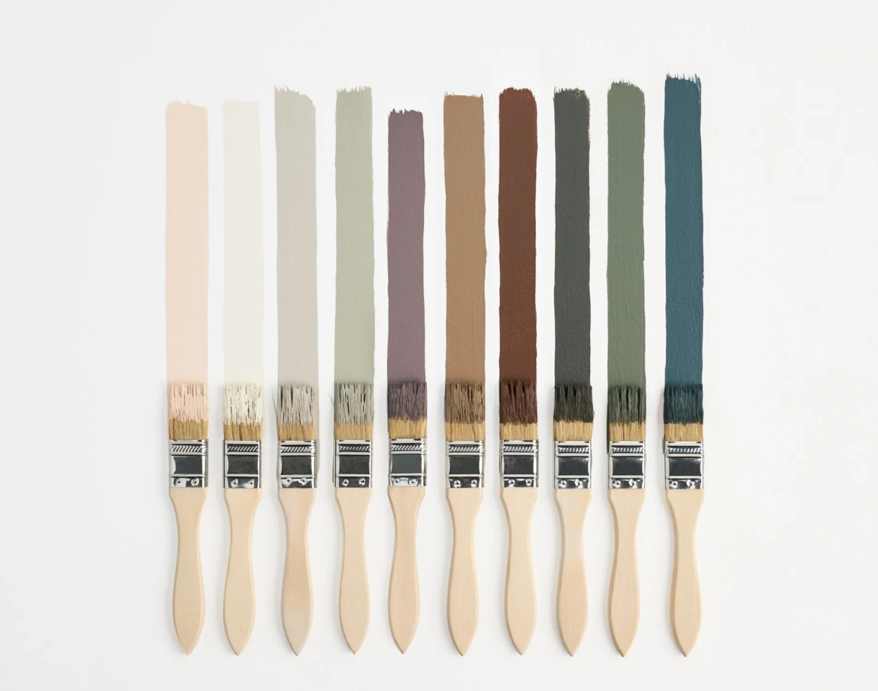
Pantone Mocha Mousse, a rich, creamy brown, exudes warmth and versatility. Unless you’re immersed in the design-world, you may not know the Pantone color of the year. I always like to compare how the pantone colors from a designer’s eye might be used in the home.
Hopping over to my go-to paint line from Ben (first name basis), Cinnamon Slate, a muted terracotta with subtle gray undertones, which offers a modern twist on earthy hues, making it ideal for feature walls or accent spaces. …or just touches of its hue in your decor.
Keeping in mind that we don’t have to flood our spaces with the color of the year. If that were the case, paint would be an annual expense. That’s not smart or cost effective — unless you’re into annual updates. You otherwise have my support.
Although the white on white on white trend is not something I’m a personal fan of, there are subtle ways to use the color while keeping your larger areas neutral. Painting the trim is a fool-proof way to incorporate warmth (regardless of what the year says the color should be). It doesn’t have to be a flooded floor and ceiling paint.

Source: File Under Pop

My best advice I can give when it comes to colors of the year, trends, and home design is NOTHING is that serious. Don’t take anything literally. Use these muses as subjective inspiration. There are a million shades of this color that yes, might give you a jumping off point.
But it’s not THAT serious.
You can incorporate color and warmth architecturally with tile work and material choices. You can hang wallpaper or opt for paint, which is easier to change out over time. …or you can simple decorate with a pop of color. At the end of the day, you should surround yourself by the things you love to look at.

Source: Zia Tile

Featuring: Block Print No. 01 in Rust

Featuring: Anemones Wallpaper in Dusty Brick
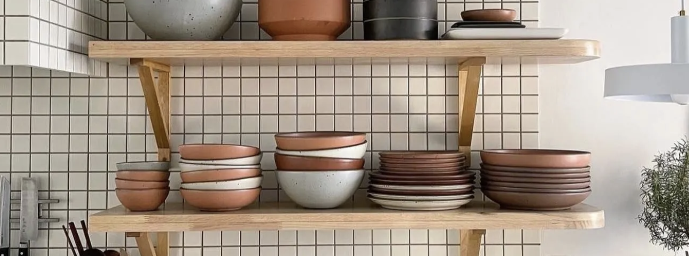
Source: East Fork


No matter how you decide to take on your home projects this year, or whether you use the Color of the Year as inspiration, it’s important to realize that you do have an inner voice and style. I’ve created a guide that hundreds have downloaded that incorporate basic design principles with that cozy comfort feel we’re all after and ways to put your own personal spin on your space. You can check that out here if you’d like!
Cheers to the new year, and ALL the colors we decide to use.
xx,
H
by Hope Johnson | inspired by nostalgia and comfort
Shop Favorite Things
-
Shop Favorite Things -

Some of my favorite things are linked through affiliate links.
This just means that if you end up purchasing anything through me, I might receive a little kick-back. I share my Favorite Things to share my actual favorite things (affiliate or not) and are all products or brands I either own or stand by.